Day 8: Soft Launching of our Store on Shopify
Sales to Date: $13,627.25
The day your store goes live is one of the greatest and most terrifying days of a store owner's life. It's where dreams can finally start becoming a reality and it's also when the buck stops here. To me, opening a new business should be approached much like getting married, because it's not the finish line, but the first step on a long journey that will require discipline, hard work and commitment. In fact, if you consider only 1 in 10 stores stay open after two years (if that), then you're statically bound for the marriage from hell!
So with that said, I'm going to go over my soft launch checklists for the next 4 weeks and what I hope to accomplish to keep the momentum going.
This is Day 8 of the series How to Run a Chop Shop, our live blog of ChoppingBlocks.com, an ecommerce business. Based on helpful feedback, we will be adjusting the format for shorter blog posts and more frequent updates to the series and also incorporate my daily dealings with our other businesses.
When a site goes live, most people have this expectation that orders will magically start to come out of thin air or something out of the “If you build it, they will come” playbook. Unfortunately, things don't quite work out that way. My proverb is that if you build it on the internet, no one will ever know except for bots, which can make up 80% of your traffic. I've seen a lot of ecommerce forum posts by owners who say, “I'm getting visitors to my website, but why isn't anyone purchasing?” or “Why are my conversions so low?'”. The reality is that all that traffic is usually noise unless you've done social, SEO or PPC marketing and are bringing real humans to the website. It's a good idea when you first launch the site to put your head completely in the sand and stop paying attention to orders. If they come, great, if not, don't sweat it.
Lesson 21: It's absolutely normal to have little to no orders in the first few months of opening your store. Stop panicking.
It's going to take time to for your marketing seed to take hold, unless you have an awesome or socially shareable product. During that time, it's great to take a bit of breather and work on your website. I know, you JUST did all that work to get your website where it was needed, but you're going to have to do more.
Soft Launch Critical Checklist
- Make sure the site works and you can actually check out. Yes, pull our your credit card and make a real purchase. Make multiple purchases over multiple days. Then refund them. Learn from my experience, when I debugged Treadmill.com for a few days and realized that I forgot to take it out of test mode. There went a few thousand in sales. Or the time I tried a new payment processor on CuttingBoard.com and assumed it was working, but finally took a phone call from a customer to tell me that it was broken.
- Call your phone number at the hours you've posted. Don't have a phone number? Then you're doing it wrong. Same goes for live chat if you have that. This seems like a simple one, because you know your phone number works, but what if you accidentally entered it wrong when you setup the site? Would you bet $100 on it? $1,000? How about $1,000,000? If the answer is no, call your damn number. I did!
- Test your newsletter sign up. Send your inaugural newsletter to your to see if you're actually getting it.
- Go through each product page. Check for spelling errors, broken images, quirky layout issues.
- Test your site on mobile and tablet. Open up your site on BOTH an iPhone and Android (borrow if you must) and make sure everything is working.
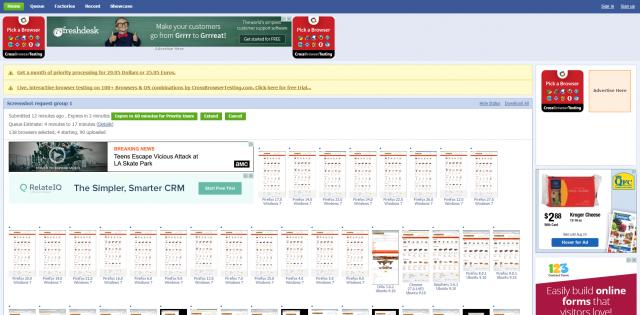
- Test your site on Internet Explorer, Chrome and Firefox. You can use free services such as browsershots.org or pay for a one month subscription to BrowserStack to test the design at a minimum. Best cast, you should install Firefox, Chrome and Internet Explorer (for our PC friends) and test it all yourself. Again, learn from our mistakes- I broke Treadmill.com's IE8 functionality after a JavaScript update that nuked checkout for two whole weeks. That went completely unnoticed until a customer called in as well. Anytime you install an extra app, script or make design changes, you should be testing to see if it works across all browsers.
- Get friends and families to help test your site and provide feedback. As an owner, you'll often be so used to your own site that it makes sense. But you would be surprised at how other people use your site. In fact, Mike's going to be publishing a post soon about BigCommerce's checkout cart and the jaw dropping behavior that he witnessed when installing a tracking software.
Here's a screenshot from Browser Shots showing a number of different browser tests (note it failed on the IE screenshots for some reason).
Here's a screenshot of a JavasScript error on an out-of-the-box Shopify theme, where I tested my store in Internet Explorer 10, using a developer document modes in IE11.
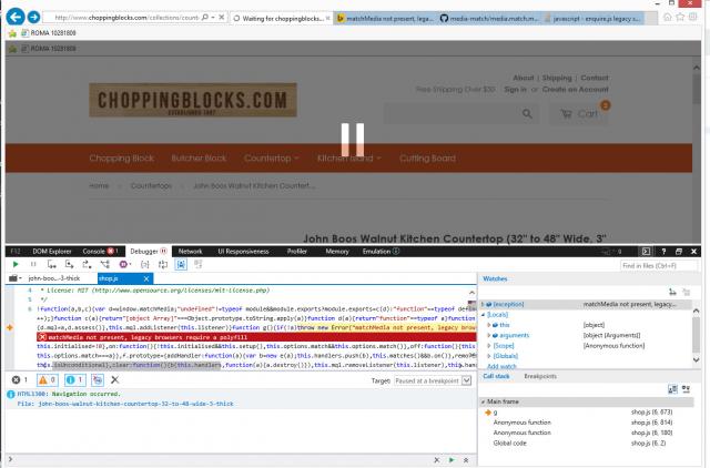
Luckily this wasn't a “show stopper” error, but I was amazed that I even had a JavaScript error on a default theme. Good thing I checked anyways instead of assuming it was error free (*cough cough, hint hint*). Here's my fix below as well:

Apparently, Shopify uses a default set of JavaScript files that do a bunch of nifty and neat modern stuff. Unfortunately, that modern stuff falls flat on it's face on old browsers. So I had to Google a fix and put in another JavaScript file that can work on old browsers such as IE9 and below. I don't expect 99% of owners to know how to fix this, but if you at least test your site on IE, you can at least know something is wrong. And yeah, I too miss the days of hitting my monitor on the side to make things work again.
Lesson 22: Can't make money if your checkout is broken. Duh.
I already know your reaction is, “No way, no one is STILL using IE6/7/8”, so I'm going to put this here for you as well.
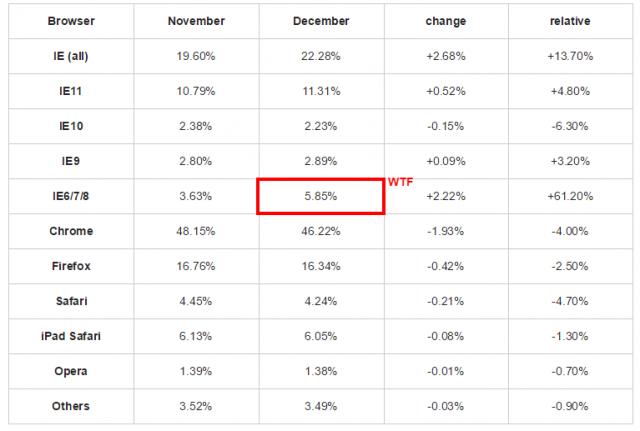
Adding all your IE6 through IE10 users, now you've got over 10% of your traffic that you could be pissing away if you've got a broken website. Imagine if you've got a PPC budget an 10% of your traffic WILL NEVER CONVERT and that should light a fire under your ass to give appropriate attention to this. IE users tend to be an older crowd as well, which usually equates to high incomes and also conversions, so it's a double whammy. Don't know someone with IE? Time to make friends with other ecommerce owners or buy yourself a cheap PC laptop.
Post Launch Checklist
The reason the tech industry has “soft launches” is to give time to test their software. Often you'll find that without other people helping to test, it's difficult to nail down all the issues at once. Since I completed my soft launch checklist and know my checkout works on all browsers, my contact numbers work and my product pages work, I can officially open the doors to ChoppingBlocks.com!
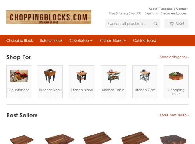
It's quite pretty. And by pretty, I mean pretty ugly. As far as utilizing everything I know about trust and what makes people buy, simpler is not always better, especially as prices go up. I'm selling expensive kitchen products, so I'm missing a lot of things in order to be firing on all pistons. That's all going to be incorporated into my post launch checklist, which is as follows:
Four Week Checklist
- Make sure Analytics are working and establish a baseline (avg pages per session, session duration)
- Tighten down SEO meta data (enter in GOOD meta descriptions, meta keywords, img alt tags for all products and categories)
- Check page load speeds regularly to determine performance (
- Use Google Webmaster Tools and check site crawl errors and redirect errors
- If I don't have existing traffic, bid on cheap PPC traffic to use as a baseline to test engagement (avg pages and duration per session)
- Run basic split A/B traffic tests to improve ecommerce conversion (I use Optimizely.com)
- Add or Improve Trust Factors (About page, contact page, site badges, customer buying guides, etc)
- Have a beer or wine, you deserve it!
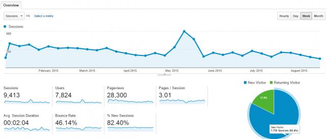
With ChoppingBlocks.com, I purchased an existing site that already had organic traffic, so I'm in an optimal position to do comparisons of how the site did on Miva vs how it's going to do on Shopify now that I've relaunched. Here's that data as a baseline:
Pulling all the way back to when the site first went onto Google analytics:
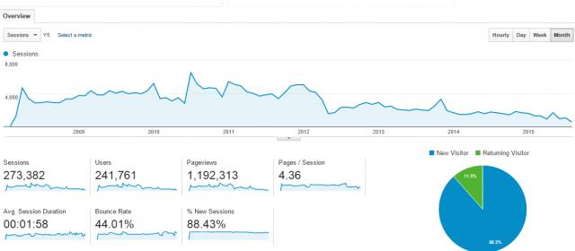
You can see that the site had a good deal of traffic is 2008 through 2012, when it finally crashed and has been on a steady decline since. The site was purchased in March, which was getting about 1/8th of the traffic that the site got in it's heyday. Over the next 4 weeks, I'll be very interested in seeing if we get any boost to our traffic from Google. Not only did the site switch from Miva to Shopify, but I rewrote all the descriptions, uploaded high quality images and put in proper meta data where applicable.
Most importantly, I'm going to be keeping a keen eye on the pages per session and average duration per session. These to me are linked hand in hand with engagement and conversions. On CuttingBoard.com, you can see how purchases are highly tied to engagement:

You can also see that I segment out my traffic so that I can actually get real, actionable data out of analytics. The blog generates the vast majority of the traffic and it has a bounce rate much higher than my paid and organic non blog traffic, so it's important to know how I'm performing on different segments.
Split Testing Explained
This will need it's entire series of post to explain as there's already many good resources available, but I'll explain with a real life example that I ran on CuttingBoard.com.
So as with many tests, this one was inspired by a visit to Hayneedle one day and noticing that they were putting many related product images directly underneath the main product, without even bothering with a description. This was an interesting revelation, which corresponds to a study by Clicktale about shoppers that are impulse buyers (most people) convert better with less descriptions. I also saw in my Crazy Egg scroll map that users were essentially not reading down to the bottom of the product descriptions. Shocking to me, because I'm the type of guy that wants to know EVERYTHING before I buy, but I'm in the minority. Plus, everyone and their mom talks about strong product descriptions, but I believe it really depends on the industry you're in on how that affects conversions. With Treadmill.com, we definitely did better with longer descriptions.
Knowing this, I changed my site around so that I put the “sidebar” of other related products directly underneath the product photos and tested it. Here are the results:
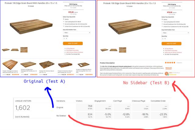
As a quick note, normally you test a theory and then put it into practice, so your original (A) is the control and your experiment (B) is the example. Because I work for myself and can't easily be fired, I often shoot from the hip and go with my guts.
The results, as you see, is that my gut was right that having the “sidebar” was more effective. Users were engaging (clicking) more on the pages with the products in the same viewport and not only that, I increased my “Add to Cart” goals by 12.8%, increased my Checkout page goal by 18.1% and my completed orders went up 23.3%. Not too shabby.
Now, as a data guy, the amount of visitors that I ran this test on isn't enough to make a concrete statement that this is true. You need a large sample size in order to verify a data set. In split A/B testing, you generally put 50% of traffic on one variation and 50% of traffic on the other and make a conclusion. In my case, I'm going to put 80% on the sidebar page and 20% on the non-sidebar page to verify my test. The reason is that again, I'm not going to be fired and mainly, I don't need to be at a 90% confidence level- I just need to be mostly confident and I can leave the test running.
So, that's your crash course in split testing 101. The beauty with ChoppingBlocks.com is that I've got an entirely brand new website that is a bare bones functioning site. Nothing special. That means it has nowhere to go but up, so I'm going to test a bunch of different variations and let you all know how it does over the next 4 weeks. The best part is that I can take the lessons I learned from CuttingBoard.com and apply them to ChoppingBlocks.com, whereas normally I would be so hurting for traffic on a new site that I wouldn't be able to make any reasonable conclusions from split testing. For the gamers out there, this is like power leveling my own store (grin).
Anyhow, I don't want to get carried away on a post about the first soft launch, but it's an important concept to wrap your head around for the long game.
Now Your Turn
For existing ecommerce store owners out there, was there anything that you learned from your soft launch? Did you even do a soft launch? If so, what advice can you share that you hoped you knew the first time around?

