Day 9: I Launched a New Shopify Store and it Killed my Conversions
This post is part of How to Run a Chop Shop, a real life blog series on attempting to turn around a struggling ecommerce store purchased in Feb of 2015 into a profitable online business in 365 days.
Sales to date: $20,815.45
For our regular readers, it might turn into a running joke that the “Day X” designations are not so much literal as they are virtual milestones. My last post detailing the soft launch of ChoppingBlocks.com on Shopify was two and a half months ago. I spent about 3 months of my time and poured a lot of resources into migrating from Miva Merchant to Shopify in order to have a cutting edge ecommerce platform that could keep up with the times.
So how did the soft launch do? My conversions sank like a fucking rock.
So, the story again is that ChoppingBlocks.com was on Miva Merchant and was built around a custom site that looked better than average, but I realized it was going to be a chore to upkeep moving forward. I took a few months to migrate to Shopify on my own, relaunched the site with all new product descriptions, updated pricing, better photos and a more-or-less out of the box Shopify theme (Supply, if anyone was wondering). Part of me hoped that the newfangled platform would be able to make up for the visual deficiencies, but apparently they could not.
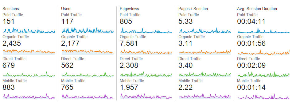
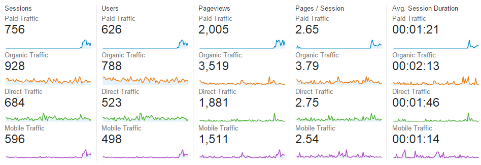
Long story short, I was at an industry average 1.9% conversion rate with the older site (which honestly was pretty good due to the high volume goods), but it dropped to below 0.20% with the new launch and my order values also took a major hit. This honestly took me a little by surprise, because my metrics all seemed within the same ballpark from the old site to the new. I was a little disappointed I didn't get a big lift in pages per visit or time on site, but frankly it would have been too much to ask for a mostly out-of-the-box Shopify theme to really shine.
Here's the segmented traffic from Q1/15:
Here's the segmented traffic from post soft-launch:
With two months of data collection from the soft launch under my belt, I knew that I needed to fix the site to bring my conversions back up and that this needed to be a top priority. On the Shopify forums, I often see the question, “Why am I not converting any traffic?” or “I have visitors but no one is buying anything!”.
The answer is usually a combination of your site sucks or your traffic sucks.
I've been A/B testing for the better part of the decade, which is why I'm all sorts of crazy about making data based decisions. Back in the poker days, when I was a major affiliate, I had up to 20 tests going at any one time. I can tell you for example that if I used a gimmicky campaign of girls in bikinis in my banners, that I would achieve fantastic click-through rates, but the conversions would be luke warm at best. On the other hand, if I used a review based ad (“8 out of 10 players recommend this site”) then the click through would be awful, but my conversions and LTV were much, much higher. Even back then, other affiliates would groan on about poor player values and what not, but I always knew what they were doing wrong on the marketing and trapping side.
With ecommerce, the same concept certainly applies, which is why I segment out all of my traffic into the core components. If I use a blended view of all of my traffic, then everything just becomes lost in the noise. Maybe my mobile traffic is horrific, but my organic is great, but it all looks mediocre so I don't know to fix my mobile site.
Using real data, you can see that my organic traffic actually has a slight lift, but my paid drops substantially. That said, I only start paying for traffic at the end of my soft launch to gather some data on the theory that my site conversions are just not good. And lo and behold, it turns out that it's true. So it's not a traffic problem.
So how do I increase conversions?
Knowing how to close a sale online is equal parts science and art. The main hurdle is how to get customers to trust you. Trust is a very interesting concept that is covered in just about every sales book that you'll read and is a fundamental part of human interaction. Without trust, there's nothing.
The problem with running a small to mid-ecommerce site that it's hard to build trust. Many store owners fall prey to the assumption that simply getting online with a store is good enough. Or maybe they have a cool mobile version of their site and now it's good enough. That's hardly the case.
Unless you are selling under $20 items or private branded items under your own label, then trust is always a fight. When I say private branded by the way, I mean things like your own line of t-shirts, your own brand of shoes or your own personal grooming line of products. At that point, I trust that you've actually made your product and aren't running a scam website – I just don't know if your product is good or not. Since ChoppingBlocks.com doesn't have it's own branded products, I need to make it known to my customers that I'm legitimate operation.
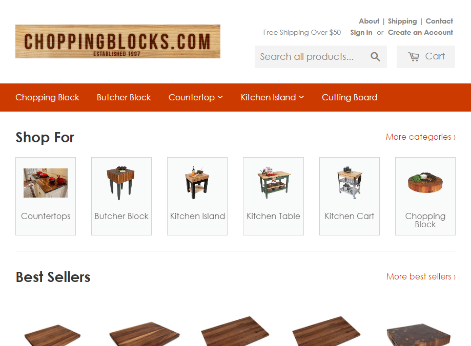
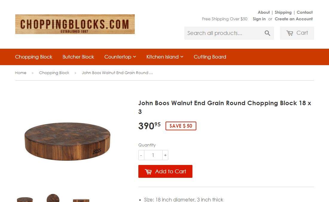
An out of the box theme even with some modifications isn't prime time ready. I'm not peddling t-shirts, jewelry or other art / fashion / design products that essentially sell themselves. While I'm a big Shopify fan, most store owners that are selling commodity or items of utility are in for a world of hurt if they think an everyday Shopify theme will suit their needs. Repeat after me, Shopify themes are not good conversion performers for these categories.
Nothing really special as you can see. My proof is in the pudding with the low conversions.
So, here's the to-do list that I came up with to get my conversions up.
- Get a professionally designed logo on 99 designs. My old logo was almost cringe worthy because I made it on the fly just to have something on the site. With 99 designs, it will take me $299 to get a new logo designed with multiple rounds of revisions. Will it be the best logo ever? No, but it also won't cost me $1,000 that most designers would charge for just a few basic ideas and one revision round at most. Once I'm pumping seven figures, I'll be fine to dump $2,000 on a logo, but for now, I just need a patch.
- Put some trust seals on my site by signing up with the Better Business Bureau. The BBB has been around for decades and was the brick and mortar version of Yelp up until the late 90s before the internet really emerged. I still remember small mom and pop shops actually displaying their BBB awards on the wall. These days, there are dozens of review services like Trust Pilot ($400/mo), Google Trusted Seller (300 sales/mo minimum), Reseller Ratings ($500/mo) and Stella Service (don't even want to know).
- Splash my toll free number everywhere. This is not necessarily to increase sales, but telling people the store number says that we're ready to take orders or help out. A sketchy shop certainly isn't interested to talking to people, so this adds trust.
- Add Olark onto the site to have instant chat with customers. If your average order is over $200 then it's almost imperative that you have some kind of way to chat to your customers, because these are large purchases and people definitely want to be assured before making a decision.
- Create a pop-up newsletter. This is Ecommerce 101, but newsletters are great ways to ensure you have a second, third, fourth, etc. chance to market to potential customers. I can also send promotions and specials to try and convert those sign ups as well. Mike and I use Klayvio as our tool of choice, as it has logic options that a normal newsletter software like Mailchimp or Aweber can't do.
- Start blogging aka start hiring freelance writers. I'm using Freelancer.com but there are dozens of sites out there that you can hire someone to write for you at about $10 to $100 an article depending on how good you want it. You can get a fluent English writer from the Philippines for $5/hr that writes at about a high school or even college level or you can hire a native US/UK English speaker with a masters degree and years of writing experience for $60/hr. Whatever you want to pay for is out there. Most important is the fact that you just need to have some type of legitimate content on your site to keep traffic fresh. Just don't expect to pay for the cheapest possible service and expect the best results however.
- Write a better “About” page. This is on me, as this isn't a job I can sub out to someone. This will involve photos, description about our company values, myself and the competitive edge that we offer over other similar sellers.
- Create color cohesion on my site with a site palette. One of the most surefire way to raise someone's red flags is to have a site where the colors simply do not work. There exists such thing as color theory and most people have a natural sense of colors that work, even if they can't pick it out consciously. I recommend sites like ColourLovers or ColorHunt to find a site palette for your website if you don't have one, as it will make designing a logo and website much, much easier. In fact, I even used ColorHunt for EcomCrew's blue/yellow palette.
- Offer a promotion. Due to some of my vendor agreements, I have a minimum floor price (MAP price), so I can't actively just compete on price (and I don't want to, to tell the truth). That said, all customers looooooove a good discount. So what can I do? I can offer discounts where it's not publicly advertised, such as on my newsletter or online chat. This is why proactively reaching out to customers are good. The ones that WANT discounts are going to find them. The ones that don't care you need to work your ass off to convert.
- Build social signals. This is somewhat of a catch-22 since I need customers and visitors to build things up like reviews, but I do have a database of existing customers and there's always Facebook, Instagram and Twitter when it comes to the other social channels. It's hard to brag about 50 Facebook followers on your website, but if you have 5,000 that you can build by doing a few giveaways or other promotions, that always helps send a signal to your customers as well.
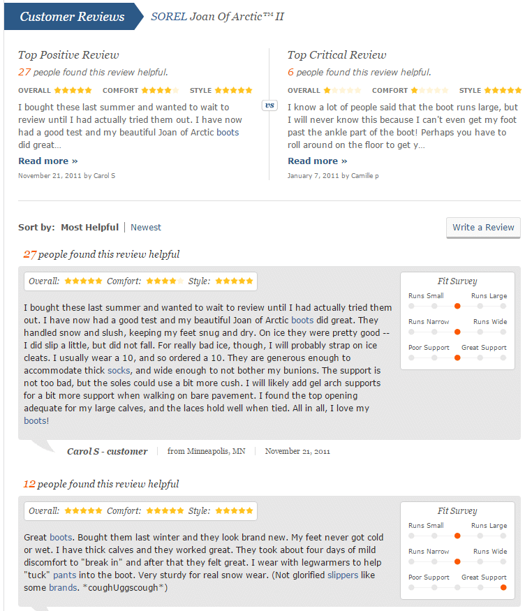
Last but not least, I need to create a story or narrative with my site design. This is the hardest lesson of them all but the most important. A good website has an ongoing theme or passive story that it is pitching you the whole time. If I go to Tiffanys.com, their website speaks to me in the same way their offline branding does; sleek, luxurious, white space and exclusive. Or if I go to Zappos.com, it takes a little bit longer to understand their story, but I realize that there is an immense amount of social proof with customer reviews, sizing surveys, available help (phone number and live chat directly on the top nav bar). With Zappos, I feel the security of the herd and know I'll be taken care of just by visiting the website. That's how powerful the design and information is.
Screenshot of Zappos review area below:
As a spoiler, much of my to-do list has already been done, but I will be posting the steps I took on how to get it done on the following Day X writeups. The good news is that this holiday season will be a first for me as well for ChoppingBlocks.com, so I'll see how well my conversion ideas worked out just as you will when everything is said and done with. Hopefully these fixes will help, but you'll know as soon as I do.
Until then.
