How We Built A 7 Figure Brand In Less Than A Year – Part 2
In Part One of this series I covered how the ColorIt brand came to life and our first few months selling on Amazon.com. Once we saw a decent amount of traffic heading to the website, we knew it was time to start development on colorit.com. Our goal of using Amazon.com to our advantage to launch the brand and make sure it was a viable product, was complete. With this in mind, we wanted to get to work. Having colorit.com would build our brand even more, give us more control, and not leave all our eggs in the Amazon basket.
I should also make a quick side note here to say that we also launched our brand on ETSY and eBay a couple months after Amazon, but the sales there haven't been all that significant. We sell enough to continue with those channels, but not enough to write a whole bunch about it here.
Planning
After running treadmill.com, cuttingboard.com, and icewraps.com I have learned a lot about conversion rate optimization (CRO). I obsess over Google Analytics and programs like Inspectlet to see exactly how my users are behaving. I also read more than I care to admit about ecommerce and CRO; on top of that, I listen to a lot of podcasts (I hear the EcomCrew Podcast is pretty good). I wanted to put all the knowledge I've gathered to this point into a new template for colorit.com. So, with that in mind, what was important to me? Well, I know (definitively) that people care about 3 things, more than anything else, when it comes to buying online:
- Free Shipping
- Easy Returns
- Trust
I'm going to say it one more time because this is soooo important. Free Shipping, Easy Returns, and Trust.
There has been study after study that clearly shows – sites that offer free shipping on all purchases, or at least have an obtainable free shipping tier, perform better than ones that don't. Over the past 2 months I've convinced 3 different consulting clients to implement free shipping across the board, or slightly above their average order value (AOV) and the results have been spectacular. I can't share the specific results here, because I would never want to break a client's trust, but it's a significant increase in business / conversions. The additional revenue always outweighs the lost shipping income.
We decided to offer free shipping on orders $30 and up, since we wanted to push people to buy a second book. Our books sell for $15.99 each, so customers who purchase a 2nd book end up spending $31.98, which qualifies for free shipping. It only costs us about $1 more to ship a 2nd book, so it's a win / win for us all around.
When you sell a quality product, your chances of returns go down significantly. While we do offer a product that is a bit subjective, because of the artwork, we had a pretty good feeling our return rate would be low. We had some data from Amazon already suggesting this, along with ETSY and eBay. If your return rate is going to naturally be low, why not just make it super easy for people to return your products? Knowing that easy returns is the second highest concern for online shoppers, does it make sense to make people jump through hoops to make a return? Just take the thing back and deal with it.
So, we decided to make our return policy pretty simple. Return the books / products for ANY REASON within 30 days and we will take it back. We even had a little fun with this when writing our return policy, saying we will take things back for the following reasons:
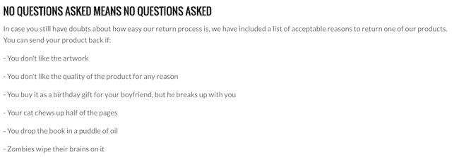
Yup, even if zombies wipe their brains on it.
Finally, there is the issue of trust. This is the hardest thing to deal with out of the gates, because so much of this is based on activity on your site. For instance, reviews help build trust. However, it's the chicken and the egg. How do you get reviews without orders? How do you get orders without reviews? Social proof helps with trust, but how do you get someone to send photos of themselves with your product if you don't have sales? Google Trusted Stores adds trust, but again without orders…
So, there are a lot of trust signals that we knew we just couldn't tackle until we had some orders flow in. However, there are several things you can control:
- Have a good looking site that's easy to use
- Have a great about us page
- Have a clear, concise, returns page
- Have a toll free number for people to reach you
- Make it easy for people to find your support inbox
- Have trust seals on your site for SSL and other things
- Have a site that works well on mobile, tablet, and desktop
- Have high quality professional images
- Show lots and lots of product photos
- Clearly communicate your unique value proposition
- Add video from the owner to add a human element
- ETC
Design Process
So, with that in mind, I went to my designer and developed a template I could be proud of. It was important to me to incorporate all the concerns above, plus a few other CRO techniques I've learned over the years. Here is a copy of what she produced. I've highlighted several areas in red boxes or arrows I want to discuss:

Starting at the top, the header is one of the most important aspects of any ecommerce site. People look here, because it's almost hard not to. So, it's important to communicate key elements very quickly. However, you don't want the header to take up a lot of room, because every pixel above the fold is so very important.
You remember what I said the 3 most important factors of buying online are right? Free Shipping, Easy Returns, and Trust. All 3 of those items are clearly laid out in this header, but yet it is only 88 pixels tall.
We clearly let customers know that they can qualify for free shipping on orders $30 and up.
We clearly let customers know we offer easy returns.
We start to develop trust based on this plus having a toll free number to call for support.
Moving down just a bit to the main menu, we have About us (with other information on a drop down menu) segmented out on the far right. This makes it easier to see. We want people to go to our about us page, because it helps build trust. We put a lot of effort into this page and even designed a custom image in our zentangle style for our family tree.
Go take a look at your analytics… you'll be shocked at how many people visit your about us page – it's very important and too many people neglect it!
Continuing to move down the page, we make it very easy for people to find what they are looking for. Want a book? Perfect, click on books. Want pencils? Great, click on pencils.
We do NOT use a slider, because sliders are dead. They are proven to kill conversion rates. We use large imagery and keep the site looking as clean as possible.
As you move down the page, we just jam all sorts of trust building into our footer. Ezra Firestone ran an interesting experiment with a “super footer”, so I wanted to try that out on one of my sites. Much to my surprise, the super footer won out and this info is now on all of our pages. We want people to see all these trust building exercises no matter where they land.
We use this opportunity to include a word from the owner (which gets a lot of views).
We include a video from a YouTube influencer, which helps build more trust.
We include real testimonials from real customers that are among our favorites.
We include trust building icons such as payment methods and SSL certificates, but we don't over do it.
We are also a part of Google Trusted Stores now, which adds even more trust.
Not surprisingly, we also spent a lot of time on our product page. Here is a screenshot of one of our product pages in action with lots of arrows to sections I want to talk about:
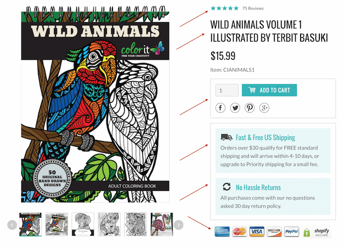
The product page is the lifeblood of any eCommerce store. After lots of A/B testing, watching hours of Inspectet videos, and applying the overall concepts I've talked about in this post, here is what I came up with.
First of all, the page is very clean. For some reason, lots of eCommerce sites make this page way too busy and don't focus on what's most important. BIG PHOTOS OF THE PRODUCT. We build our site to be 1000 pixels wide and devote 600 of those pixels to the product photos.
I just did a random search for “buy socks online” and clicked on the first result. Here is what not to do:
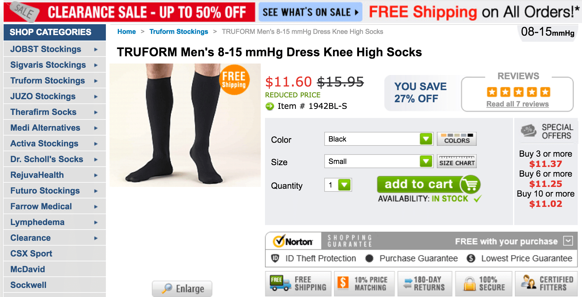
I seriously don't know where to look first and the product, you know, that thing you are supposed to be buying, almost seems like an afterthought. It's soooo important to use large photos of your product and several of them. If I were running this sock site I would have photos from the side, back, front, close up, in the package, etc.
Sticking on the theme of what not to do, this sock site also looks like someone barfed all over the screen. I seriously don't know what to look at first. It genuinely gives me a headache.
Anyway, back to our site….
What do people care about? Free shipping, easy returns, trust.
We deal with that by showing the reviews for the product right at the top.
Then we isolate the add to cart button to make it easy to find / see.
Most importantly, right below that, in close proximity of the add to cart button, we tell people once again about free shipping and easy returns. Inspectlet's eye tracking shows up, people look here and care about this.
Since launching the site we have continued to add tweaks and we've seen our conversion rate continue to climb. The result? Well, here is a recent day's conversion rate:

Conclusion:
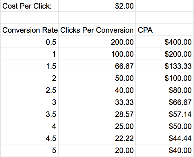
The reason we put so much effort into the look and feel of our theme (CRO) is because conversion rates have a profound effect on the cost per acquisition (CPA) for your site. For instance, if your site converts at 1% and you are buying traffic at a cost per click (CPC) of $2, then it will cost you $200 to acquire a sale. However, if you can get your site converting at 4%, then your CPA goes down to $50. That's 4x lower than a site converting at 1%. Suddenly traffic that might not have been affordable, or a site that seemed like a failure, is profitable. I put together a quick and dirty chart of conversion rates and the effective CPA below. This is based on a $2 CPC.
Armed with a site that we were proud of, we launched colorit.com on December 5, 2016. We must have done something right, because we got our first sale the same day.
What Did It Take?
Before wrapping up this post, I want to take a minute to get into the details of what it took from a time and cost perspective to pull this project off.
I started talking to my designer the week before we left for China and the Canton Fair. That was in mid October, 2015. I have an amazing designer that I have been working with since 2011. While she isn't cheap, she just “gets it,” and does an amazing job for me.
It doesn't come without effort though. I don't just email her and say “Make me a site for ColorIt.” Quite the contrary. I email her a list of sites that I like and highlight particular elements of each site. She then comes up with something based on my comments and uses a color scheme that makes sense. For instance, I really liked this product page from Reebok.com:
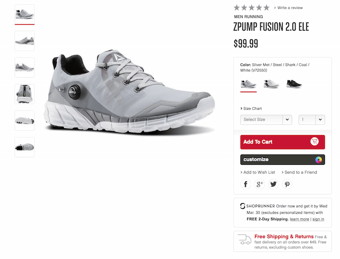
By time I returned from China I had a very close to final template from her. It took about 3 more days of back and forth and we were good to go.
From there, I turned the PSD files over to my developer along with a multi-page requirements document. This is where my background in IT really comes in handy. I know that by Project Managing a website like this I can greatly reduce costs and keep the development cycle short. Most people have no idea what they want and have to request changes over and over again along the way. Then, they get mad when the price goes up. I tell the developers every little detail including what should happen when you click on each link, what images to use, how I want the back end setup, etc. I don't leave room for interpretation anywhere. Again, this is to ensure things are perfect the first time around.
The end result was getting the project done for right around $5,000 all in. This includes the design and programming. I started talking to my designer in mid October and wrapped the project up in early December. I personally invested about 150 hours of my time into the project as well.
The site is built on Shopify, which I highly recommend. After running stores on both Shopify and BigCommerce, I'm so much happier on the Shopify platform. In fact, I'm going to be switching my BigCommerce stores over to Shopify later this year.
Now that we were armed with a website, it was time to get to work getting traffic and sales. You'll have to wait until part 3 of this series for the inside scoop of how we grew our sales. Here's a sneak peak at what we did in February 2016:
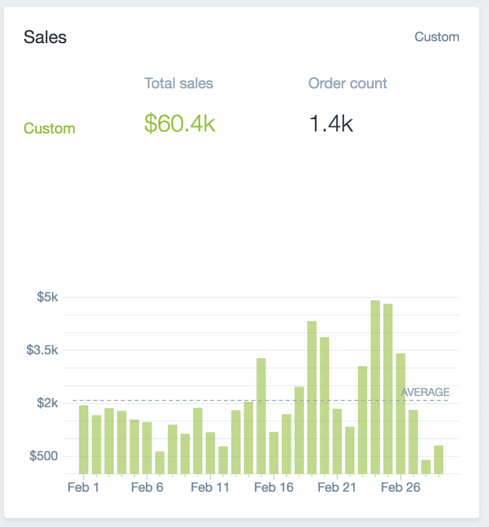
That's just on ColorIt.com, so it doesn't include Amazon, ETSY, or eBay sales. This was only our second complete month of operations. I'm very excited to see where things go from here. Stay tuned for part 3!
This was an awesome post, thanks for sharing! I really like how you broke down the design of the home page and product page to build trust
Thanks so much Alan. Glad you enjoyed the post.
Great post! Thanks so much for putting it down. Can I ask how many calls you actually get on the toll free number? Also if you can share maybe a sample or early rendition of a requirement doc I would love to see what one looks like.
Thanks very much Marc.
We get 2-5 calls on our toll free number per day on both ColorIt and IceWraps. Sometimes they are a pain to answer, but we noticed while running treadmill.com that our conversion rate spiked once we had the toll free number on the site. Just having it there signals in people’s heads that support will be there when needed.
I like to share a lot on EcomCrew and other forums about our businesses, but I feel that sharing the requirements doc that I spent countless hours on is taking things a bit too far. I’m sorry, but that’s one I’m going to have to hold closer to the vest.
Great post Michael, really like how you guys operate :)
Thanks so much Fabio!
Hi Michael,
This is a great post. Thanks for sharing such great insight. It’s helpful to hear from a successful eCommerce entrepreneur how to make this work..
I had two questions:
1. Would you be willing to share your website designers contact details?
2. Do you know of any third party customer service reps that you would recommend (e.g. Help Scout, Zen Desk)?
Thanks,
Davidson
Hi Davidson,
Thanks, we’re glad you like the post. In terms of CRM platforms, we both use Helpscout and find it a lot easier to use than Zen Desk for smaller teams. As for our designer, I’ll have to let Mike get back to you on that as we’re a bit selfish on sharing our resources depending on the current workload :)
Thanks for the post Michael! I’ve been reading your posts all morning and getting valuable info.
Davidson- I’m sure Michael wants to keep his designer for himself since he sounds like he has a lot of businesses for him/her to work on. But my team does a lot of ecommerce and will share our contact info.
http://www.evolve-creative.com And priced very good. We are in MN.
Hi guys,
I just heard the podcast on “My wife…” so i came hear looking for some details on the email funnelling you were doing. You were talking about various emails you send out after different periods … I was driving at the time and there doesnt seem to be this info on the podcast show notes. Anywhere I can find a rundown of this sort of thing?
Cheers
Mart
Mart,
I think you might be talking about the promotion we run at this link: http://offers.colorit.com/facebook-4-free-drawings
If you signup there you will see the flow in action.
We also send out emails if you signup for our newsletter, or make a purchase from us.
Let me know if you need anything specific. Thanks for stopping by.
Mike
Love this article! So much useful information here! One thing does come to mind though. After reading your article about the frozen yogurt franchise I can’t help but wonder if you are on the front end of a similar trend with adult coloring books. A quick look at Google Trends shows a notable decline in interest after the holiday season. Do you think this is due to the normal spike in searches/traffic that we see around the holidays making it appear as though there is some decline or do you think adult coloring books could just be a fad?
I (and Mike may disagree) think that coloring books is certainly going through a rapid growth phase which is usually never sustainable at the rate that it is. That said, are there still legs left? We both think the answer is yes for some time.
Holidays are very normal for spikes in just about any retail product, so that’s a bit of a false signal. Even products that only do well during the holidays though are not a bad niche (think Hickory Farms).
Good stuff!
Thanks very much Kevin.
Michael & Grant,
I first heard of your site through your Podcast on My Wife… and I have been devouring your blogs and podcasts non-stop. This is truly fantastic stuff and I am hoping you’ll get around to a Part 3 some time! I can’t wait to continue learning from you guys, and am rooting for your continued success.
Best,
Henry
Thanks Henry, we appreciate the comments!
Great stuff, Mike! When is part 3 going to come out?
Is there a part 3 to this post?
Hi Andre – I don’t think there is.